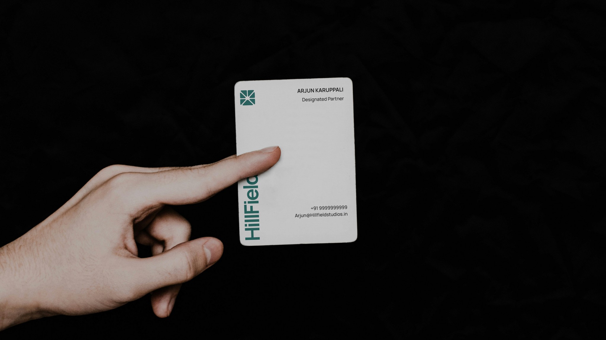
Client
Arujun Kurupalli
Year
2025
Project Type
Commercial
Project Category
Visual Identity
Credits
Visual Identity: Mohamad Azeem
Presentation: Mohamad Azeem
Brand Introduction
Hillfield Studios is a media production company based in Bandra Kurla Complex, Mumbai. They work on films, music, and TV shows, helping creators turn strong ideas into real content that people enjoy and remember. From writing and recording to editing and publishing, they handle every part of the process. Their main work includes movie production, sound recording, music publishing, and television content.
The team at Hillfield Studios works closely with filmmakers, musicians, writers, and artists to make sure each project is high-quality and done with care.
HillField Studios©
Brand • Vision • Story
Hillfield Studios is a media production company based in Bandra Kurla Complex, Mumbai.
They work on films, music, and TV shows, helping creators turn strong ideas into real content that people enjoy and remember. From writing and recording to editing and publishing, they handle every part of the process.
Their main work includes movie production, sound recording, music publishing, and television content. The team at Hillfield Studios works closely with filmmakers, musicians, writers, and artists to make sure each project is high-quality and done with care.
Brand Logo
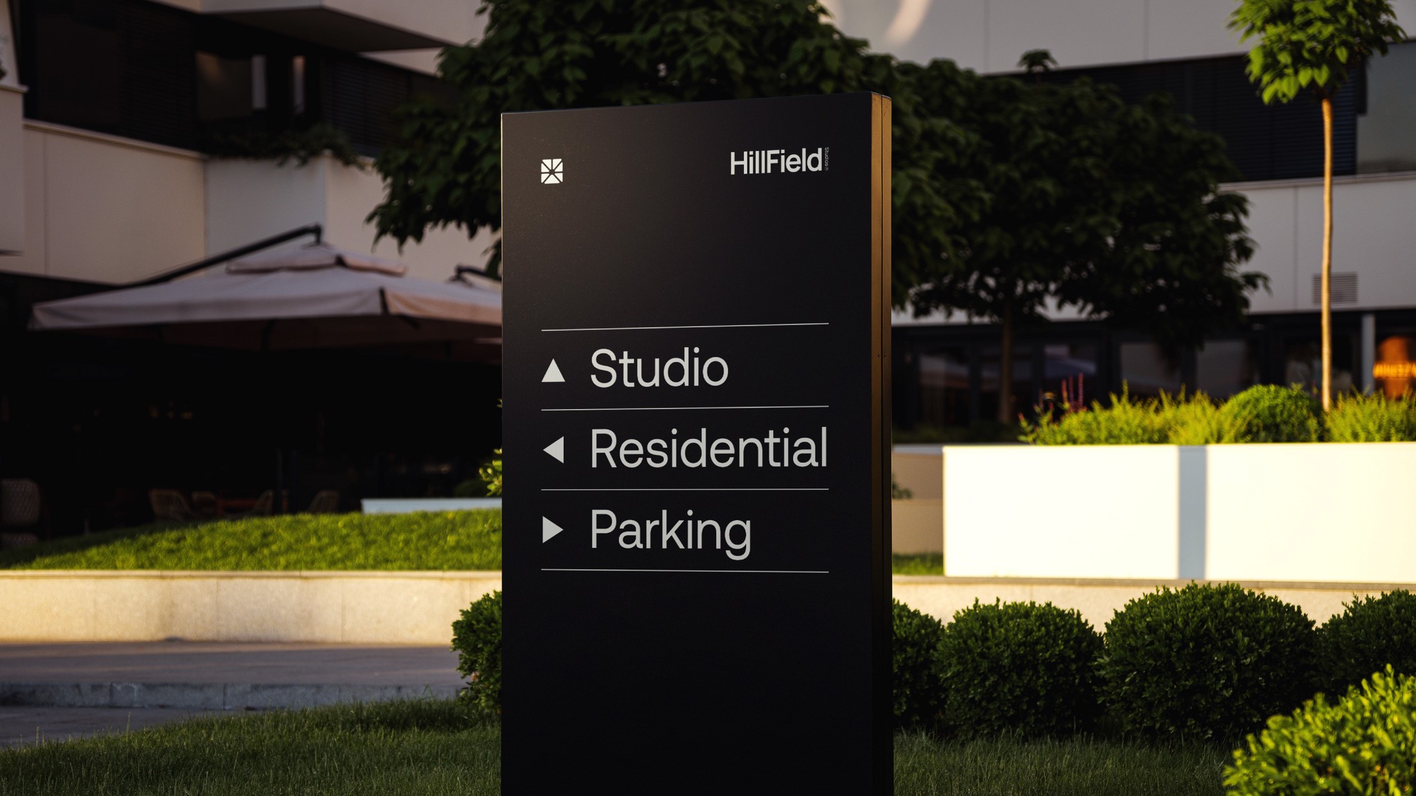
The logo combines four key elements: a hill at the base to reflect the brand name, a camera shutter to represent storytelling, and a sun in negative space, symbolizing new ideas and creative energy. The rounded corners add softness, trust, and a modern feel — important for a media brand that moves with trends and stays relevant.
The logo structure
The logo have rounded corners to give it a modern, friendly, and approachable look. This softness helps build trust while also showing that the brand stays current with trends — an important trait in the fast-moving media industry.
The design follows precise horizontal, vertical, and 45-degree spacing, which creates a strong sense of visual balance and harmony. This structure ensures the logo looks clean, intentional, and professional in any setting.
Typography
For the brand’s primary typeface, we chose Manrope — a clean, modern sans-serif font with sharp edges and balanced proportions. Its width-to-height ratio gives it a strong visual presence, making it ideal for headlines and key messaging. We’ve also adjusted the kerning (letter spacing) to create a sense of closeness, which complements the logo mark and adds to the overall balanced look.
The secondary typeface is DM Sans, another sans-serif font chosen for its simplicity, clarity, and modern appeal. It will be used for body text across all digital and print materials — including websites, presentations, and documents — ensuring readability and consistency throughout the visual system.
Color Pallete
We chose a monochromatic color palette over analogous or complementary schemes to maintain focus and cohesion. The colors we chose for the brand are shades of Genoa — a cool, deep green that reflects the idea of a hill, directly tying into the name Hillfield Studios. This choice was made to give the brand a sense of stability, freshness, and connection to nature, which also aligns with creativity and growth.
The different shades of Genoa work well together and are strong enough to create a unique and memorable visual identity. They offer flexibility for use across all brand materials — from the website to video overlays and print — while still keeping a consistent, recognizable look.
This color palette also helps the brand feel modern and professional, without being too loud or trendy. It's timeless and versatile, making it a strong foundation for building long-term brand recognition.